
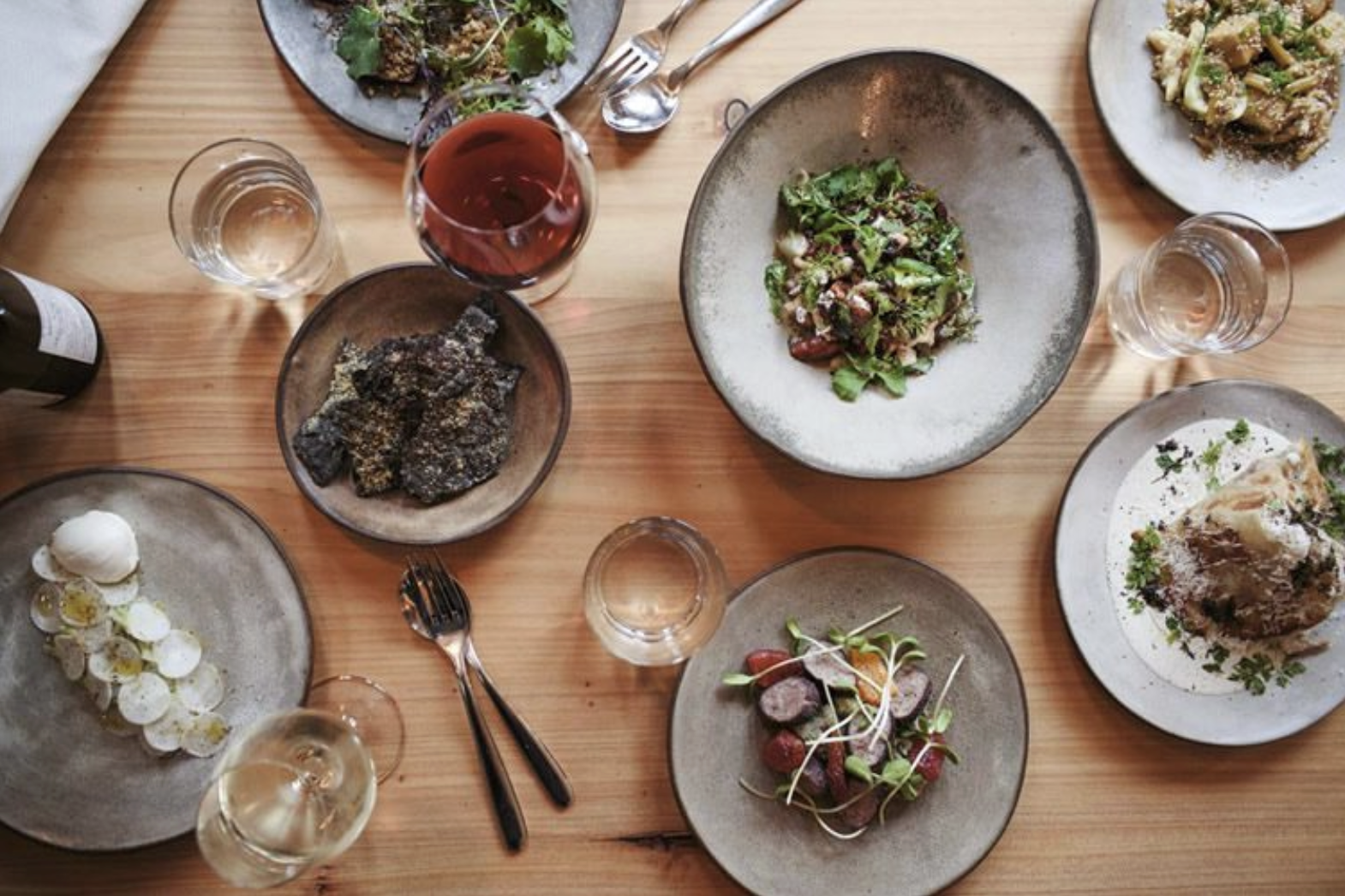
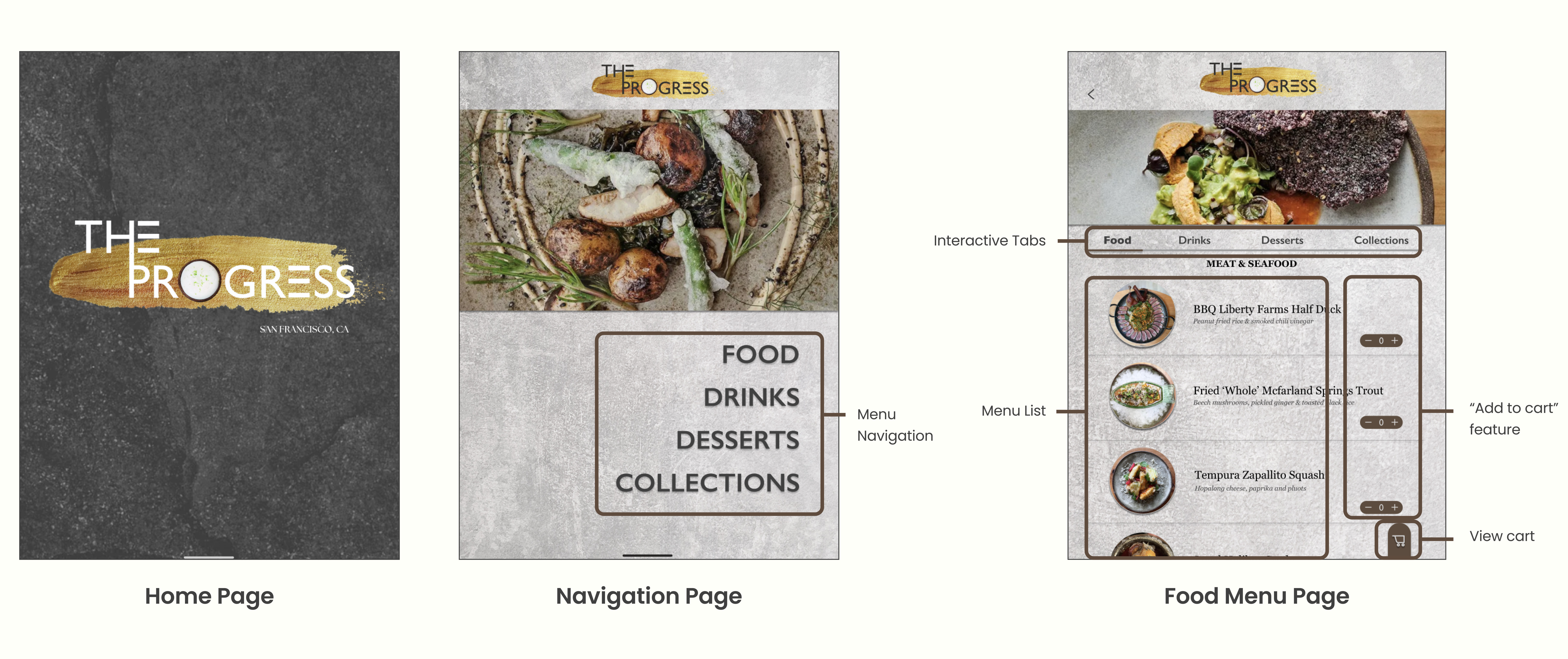
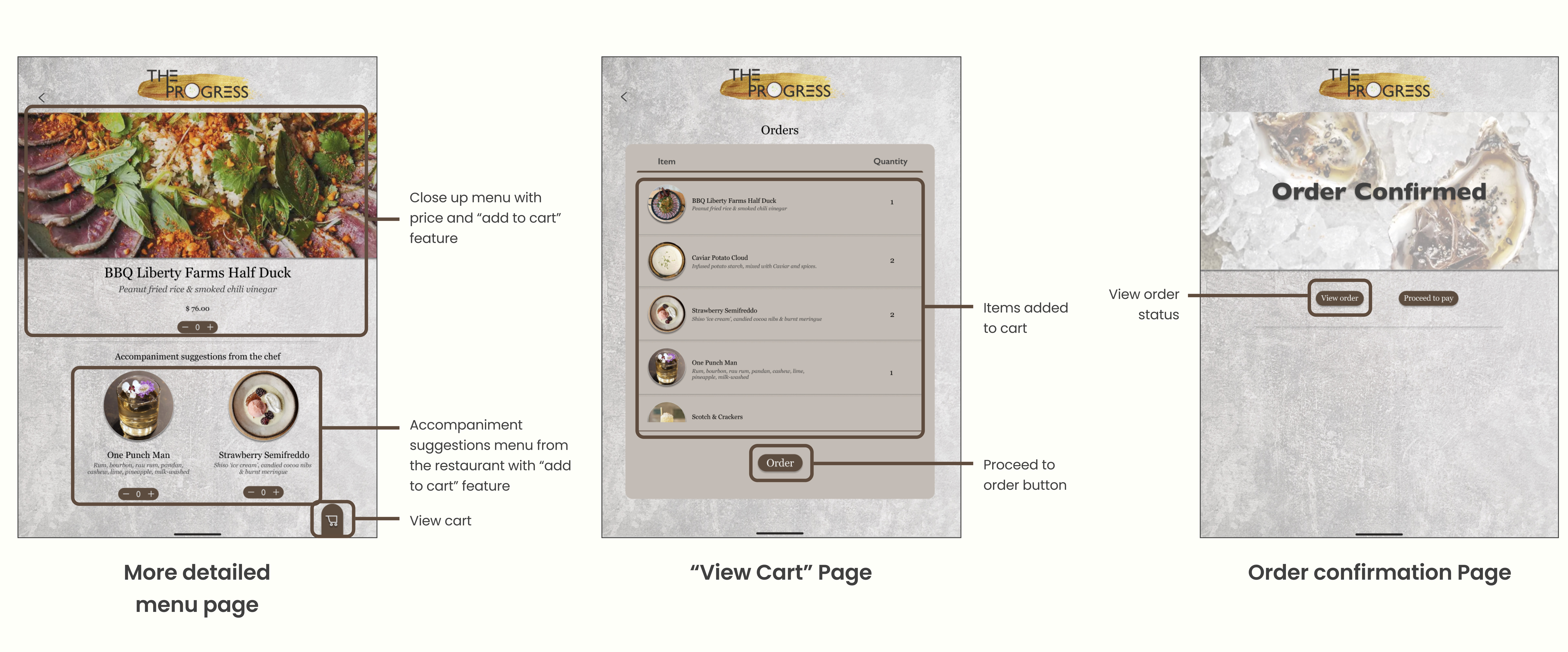
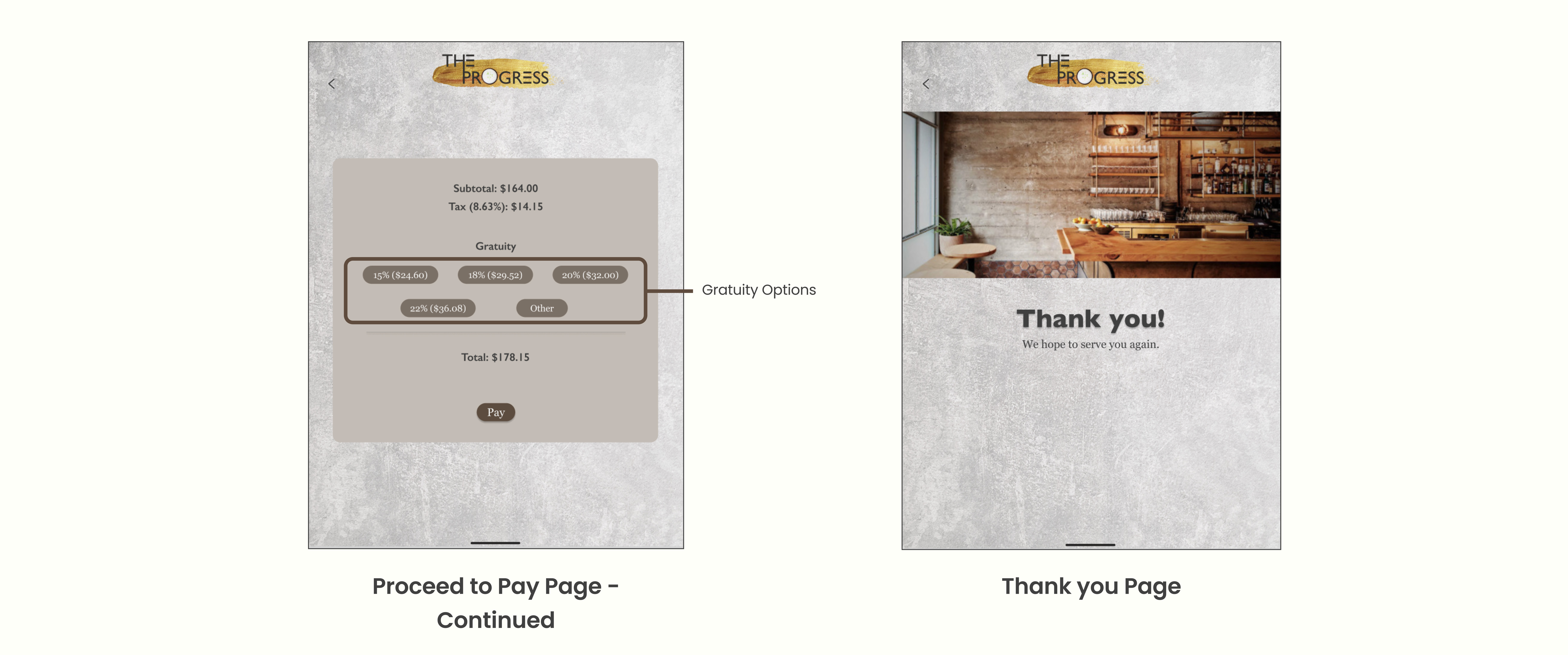
The Progress is a Michelin contemporary American cuisine restaurant in San Francisco, CA. The Progress is a group of passionate food creators creating a new and innovative way of dinner and elegant serving concepts. All dishes are curated with a balance of quality and creativity, grown and made from scratch using local products, and served in a banquet style, along with memorable wines and cocktails for everyone to enjoy.
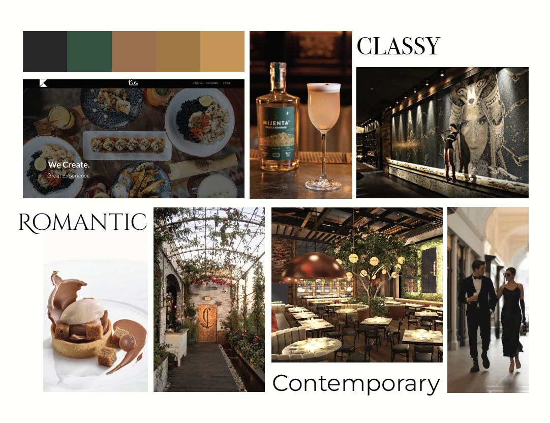
I experimented with different designs that speak to and represent the restaurant. The Progress serves a high-end dining experience with a classy, contemporary, and romantic ambiance.
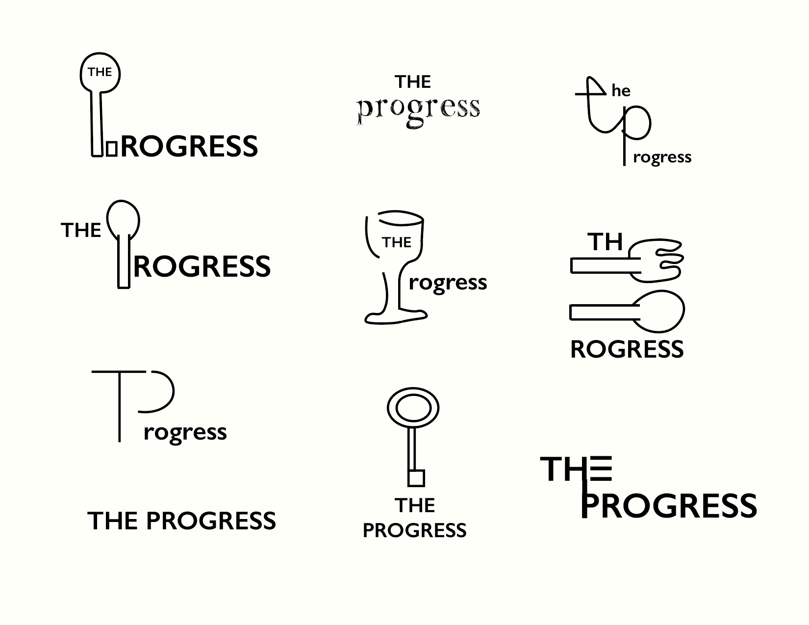
Initial logo sketches
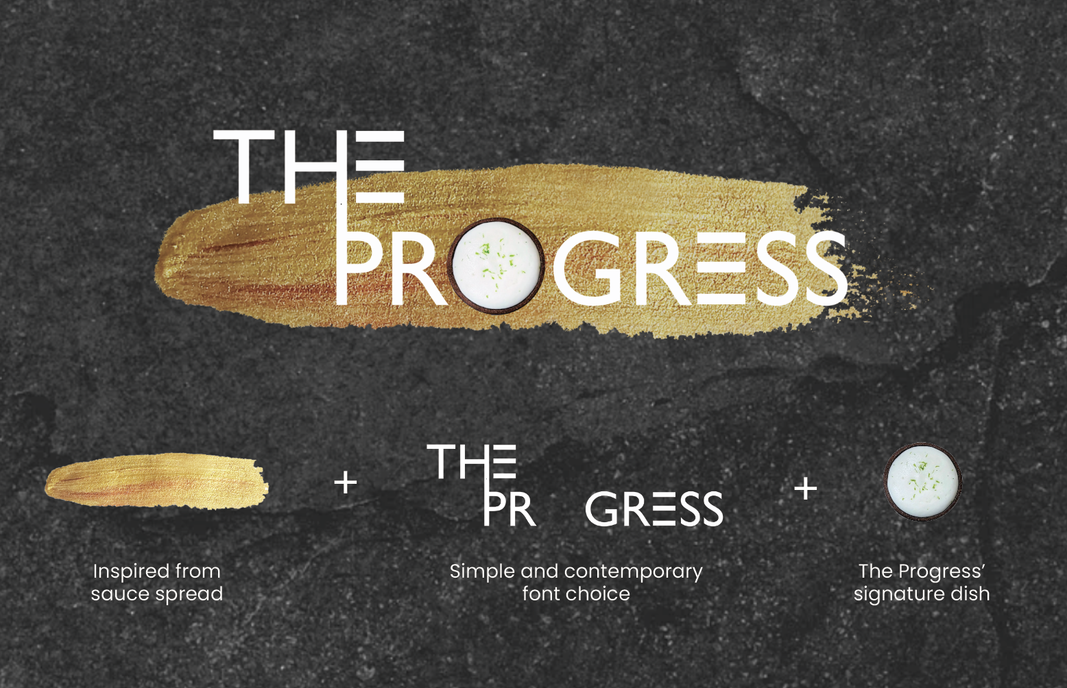
Developed logo design
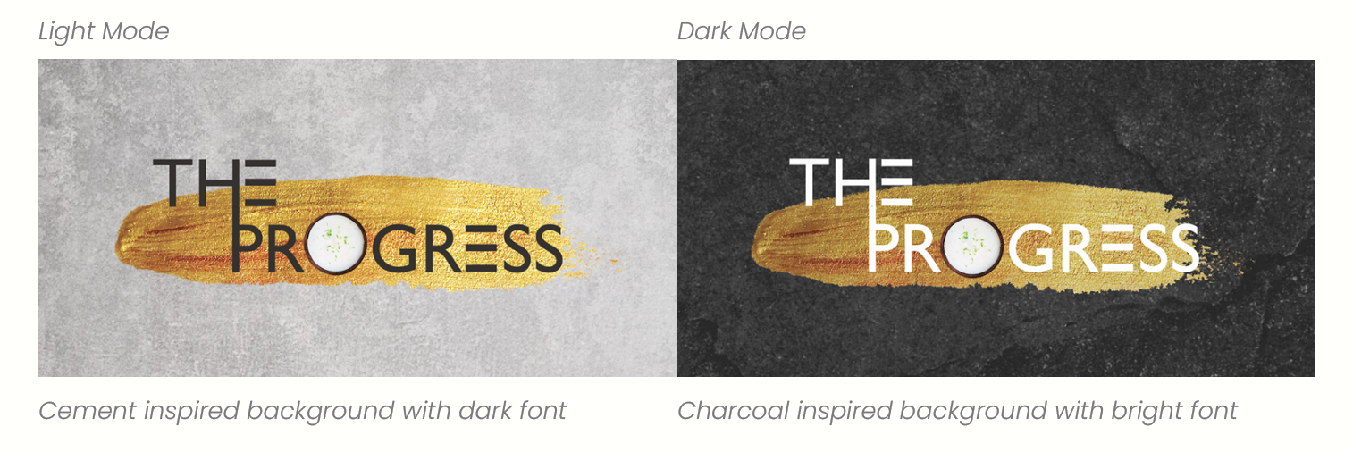
I developed both light and dark color schemes for the restaurant's logo for variation purposes. High-contrast colors are being applied to its font to make it stand out. The light mode color variation suits a more casual yet contemporary dining experience. In contrast, the dark mode color variation suits a more formal, intimate, and elegant dining experience.
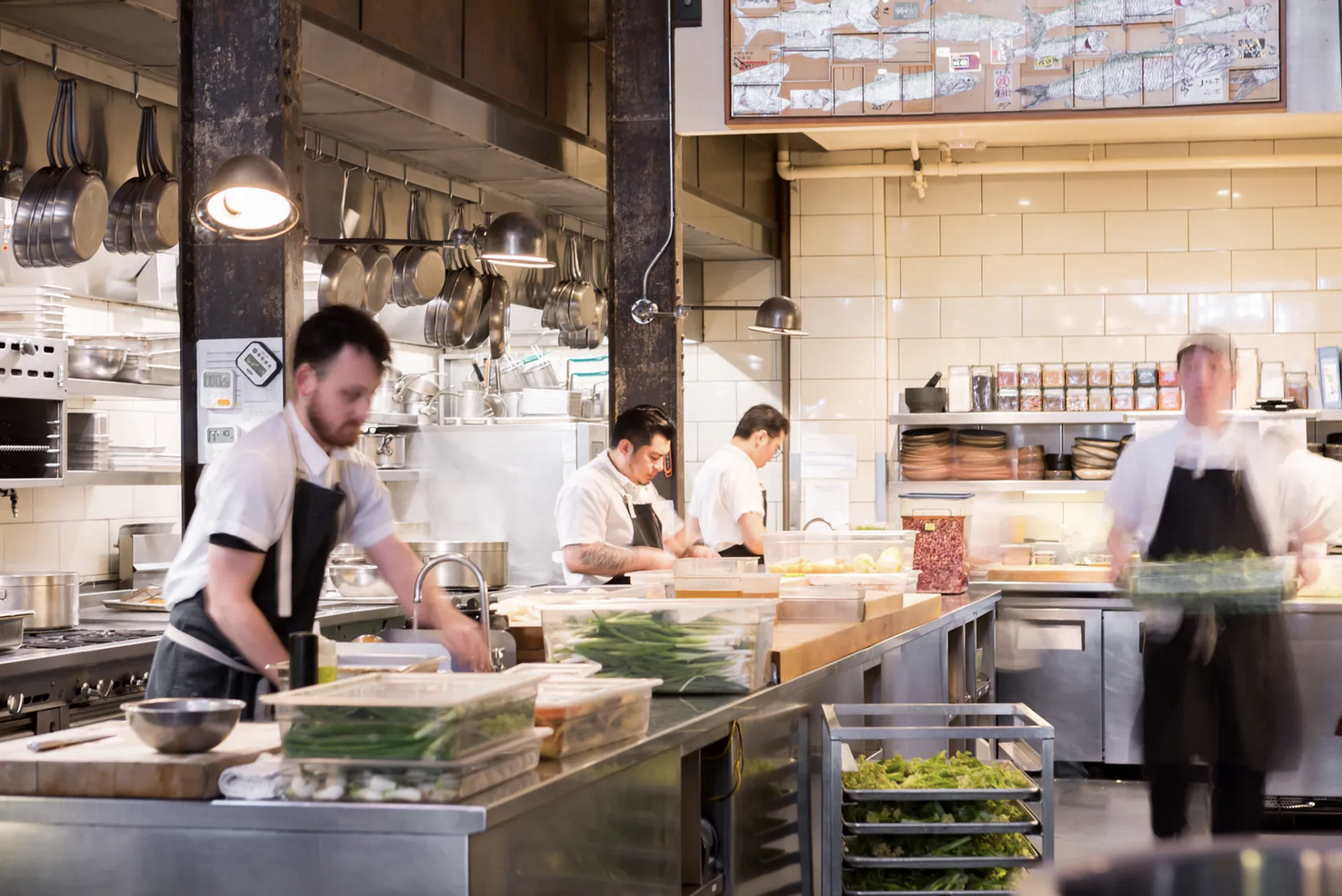
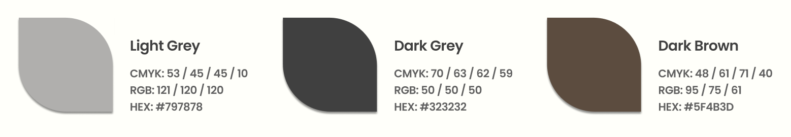
The restaurant's interior ambiance heavily inspired the logo color choices and color palettes for this rebranding project. The Progress has a soft industrial look found in the unfinished interior cement walls, dark-colored columns, and the restaurant's table service collections, usually in monotone colors—light and dark grey, dark brown, etc. The Progress also adopts a warm cabin look to warm up its overall atmosphere through a combination of light and dark wood panels. Hence, light grey, dark grey, and dark brown would make an ideal color variation for this rebranding project.
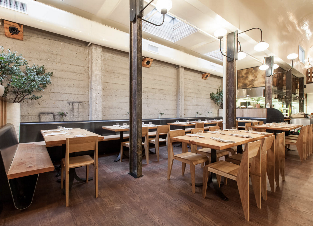
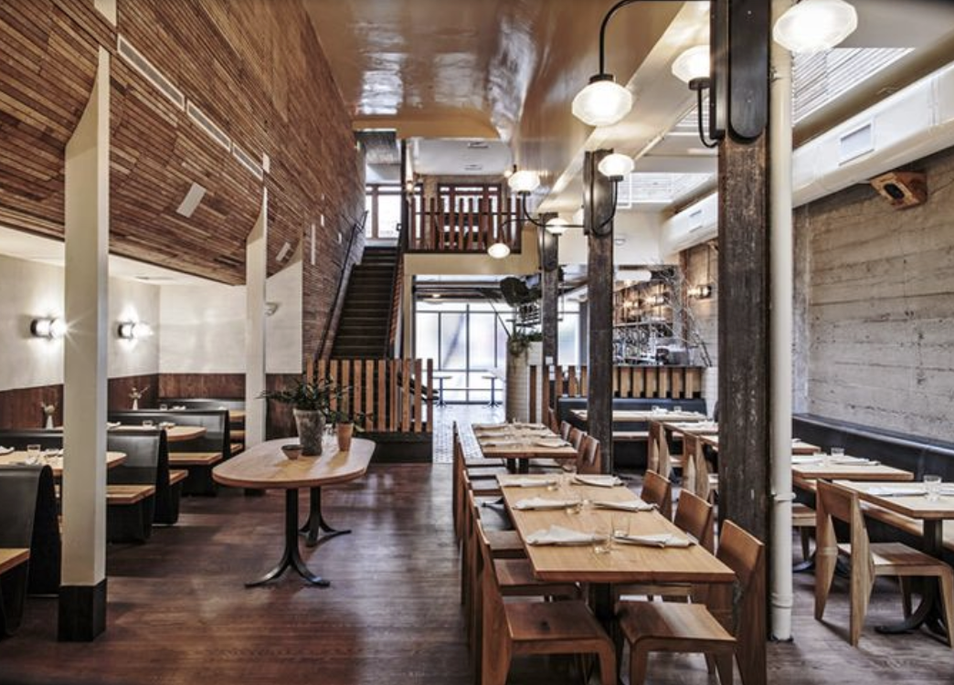
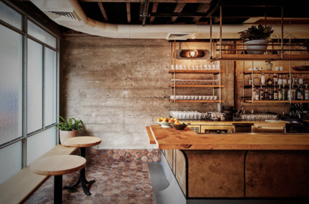
Interior of The Progress restaurant

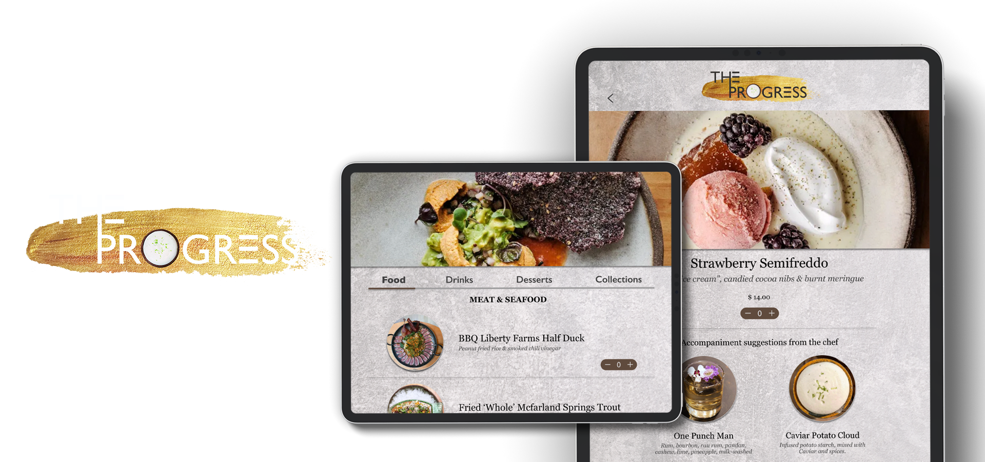
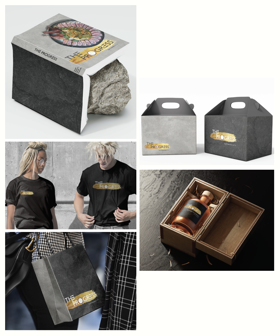
Developed and created various merchandise mock-ups for The Progress that complemented the selected color palette and new logo design.
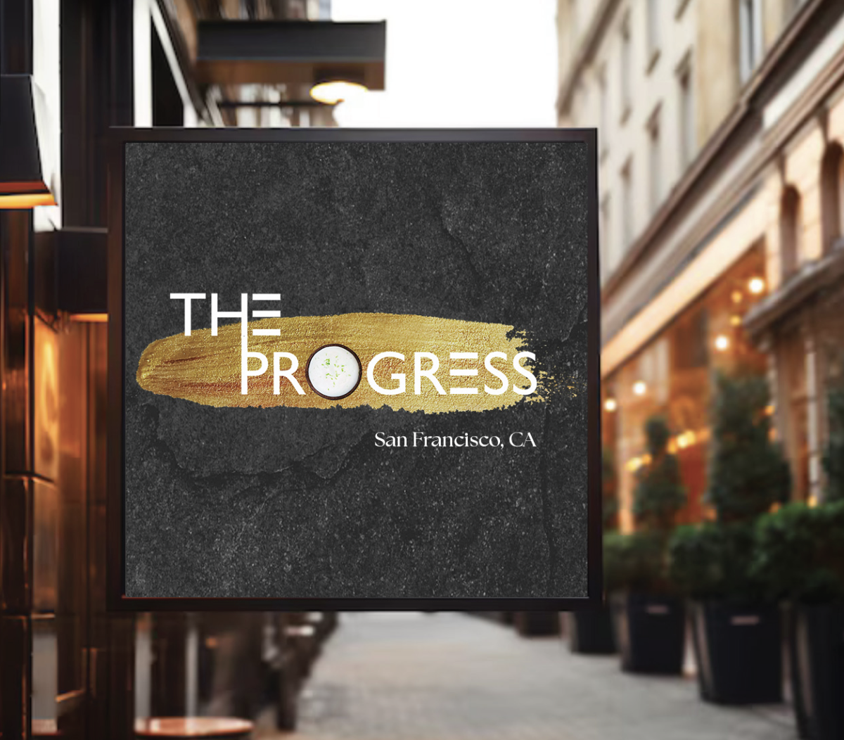
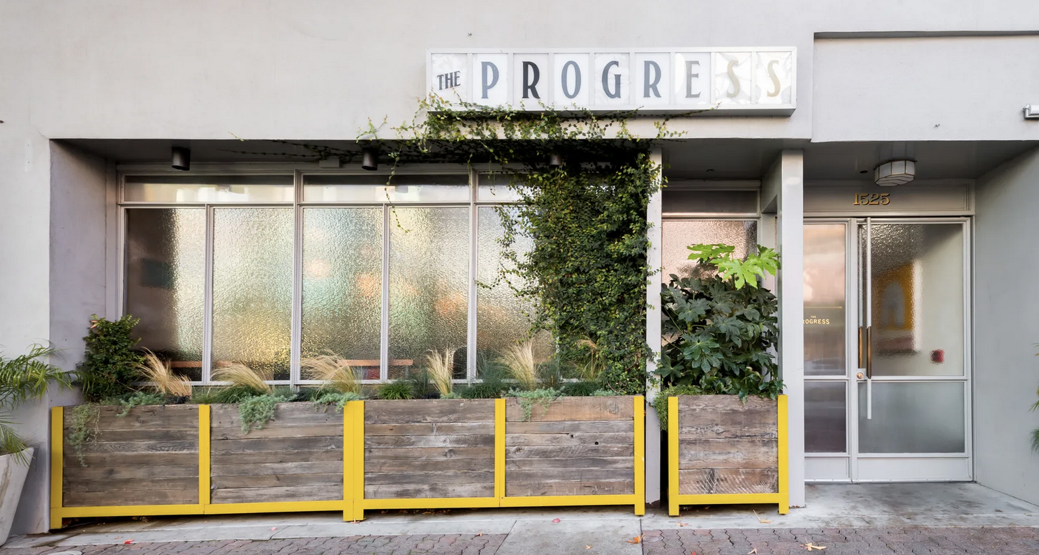
Restaurant Signage
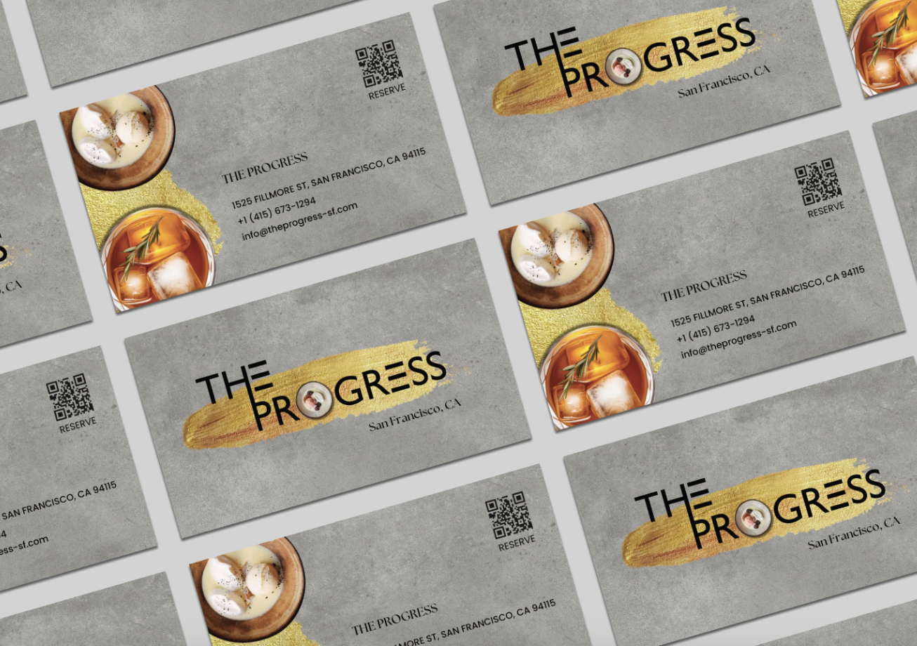
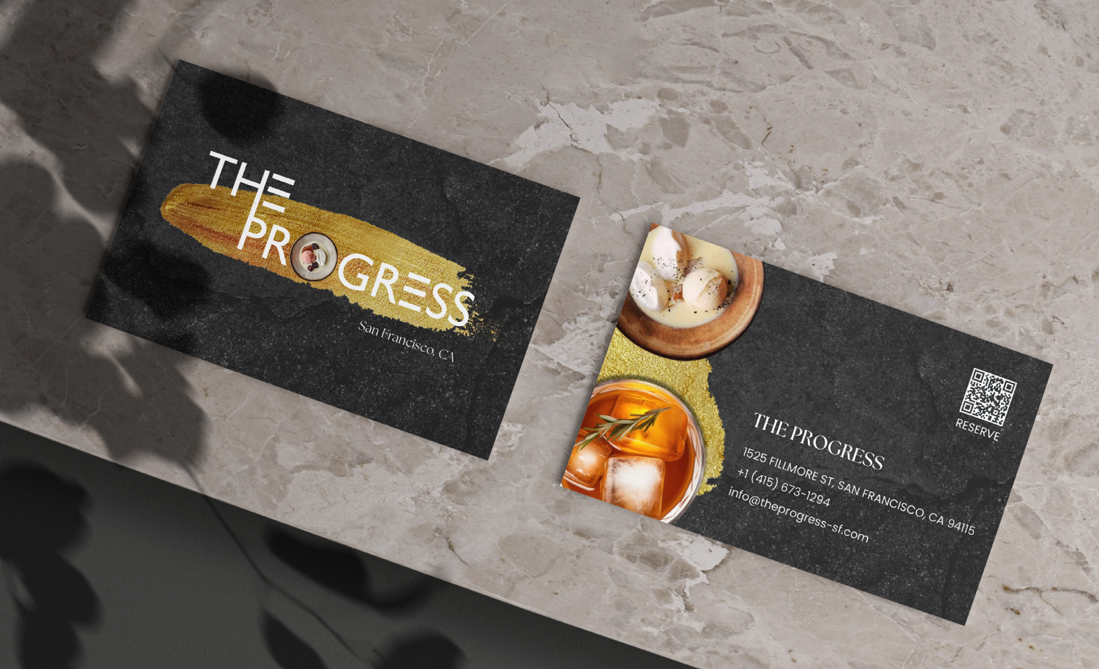
Business Card design in two different color tones
© Nadya Kosasih 2025
nadya.savitri.k@gmail.com